The Easiest Way to Pick Pantone Swatches
Imagine you put hours into your moodboard picking the perfect brand images, only to feel lost when it comes to choosing a color palette that expresses your brand heart. Here's a simple, quick Photoshop guide to picking the exact Pantone swatches from your moodboard! It really can be this easy.
Step-by-Step
1. Open your moodboard in photoshop
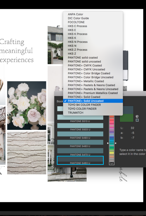
When you have your moodboard open, go to the eyedropper tool and select a color in your moodboard you love. Then, double click on the two color squares (at the bottom left of my screen) to open the colors your eyedropper picked. Then, the lightbox in the second image below will open.
2. choose pantone from the swatches in the color panel
In that lightbox, choose the correct Pantone swatches to select by default. Then, every time you click on a new color in the moodboard, Photoshop will automatically select the closest Pantone Uncoated swatch.
3. check colors in print
My favorite resource to double-check the print colors is to reference my Pantone chips book (pictured below) that I received through eBay. This way, I can mail my clients the exact swatches. On-screen is just so different than printed out, and even different than the precise print color from Pantone.
Did this help you? Find us over on Instagram @cremebrands and let us know!


