How to Get (and Keep) Attention on Your Website!
First impressions are important, and in the digital age your website is key to making a good first impression. You only have 50 milliseconds to get someone’s attention on your website. 0.05 seconds. So you need to make the most of it. We’re giving our top tips on how to capture and keep your clients’ attention with stunning photos, graphic design, and clear content.
MAKING A GOOD FIRST IMPRESSION
How long do you have to get someone's attention on your site? 50 milliseconds. That's 0.05 seconds.
WHAT?! Yes, you read that right.
So what does this mean for branding and website design? We have two primary goals when it comes to making sure your website hits home with your ideal client: stunning graphic design and photos along with clear content. These two details are key to capturing and keeping your audience’s attention. But what exactly makes them so impactful? Keep reading to find out!
WHY PHOTOS + GRAPHIC DESIGN ARE SO IMPORTANT TO YOUR WEBSITE
You can't actually digest content in 0.05 seconds. Even with speed-reading. You're not taking in specifics to form a first impression. That’s why logo design, graphic design, and photos are so important when it comes to website creation. Your website needs to feel visually appealing to the specific person you want to sell to.
But remember, branding is so much more than just a logo design or just a color palette. It's the ability to capture (and keep) attention. It’s the ability to strike an emotion, to make people feel something. Which means that your brand strategy should be at the forefront of your website design.
Ultimately, your brand design should reflect you as well as the ideal client you want to reach. Because it is those initial visuals on your site that are going to capture their attention, make them feel something, and ultimately draw them in.
Think of it as window shopping. The shops with the beautiful visuals and merchandising are the ones that beg you to walk through their doors, right? Your website is the window to your brand. In the growing digital age, your website is one of the first places your clients are going to find you. It’s the silent seller for your brand. So the photos and graphic design on your website should speak to your dream client and ultimately capture their attention.
Now, the question is, how do you keep their attention? The answer – clear content.
HOW CLEAR CONTENT KEEPS ATTENTION ON YOUR SITE
The written content on your website needs to be simple, but engaging. It should be served up in a format that makes it obvious what the site is about and where your client needs to go next. Make it creative and unique to your brand, but also remember to keep things clean, clear, and concise.
Although all sites have their own specific goals, there's one universal goal that needs to happen no matter how innovative or out of the box you're trying to be. One thing needs to be at the top of every website:
What you do, why you do it, and who you do it for.
We cannot stress this enough! If there’s one thing you take away from this post, remember - what do you do, why do you do it, and who do you do it for. Think of these as the three w’s of branding. What, why, and who. Depending on your business, it may be helpful to include “where” in there as well. In order to keep your audience’s attention, these details need to be crystal clear on your website.
Nope, this isn't just about SEO robot gobbly-gook. Although, SEO strategy is very important to helping people actually FIND your wonderful website. This is also about the humans who decide (very quickly) if you're what they are looking for. Once 500 milliseconds pass and they are interested visually, make sure they see at a glance that you offer what they are looking for. That will absolutely hold their attention on your website and make them want to learn more about your brand!
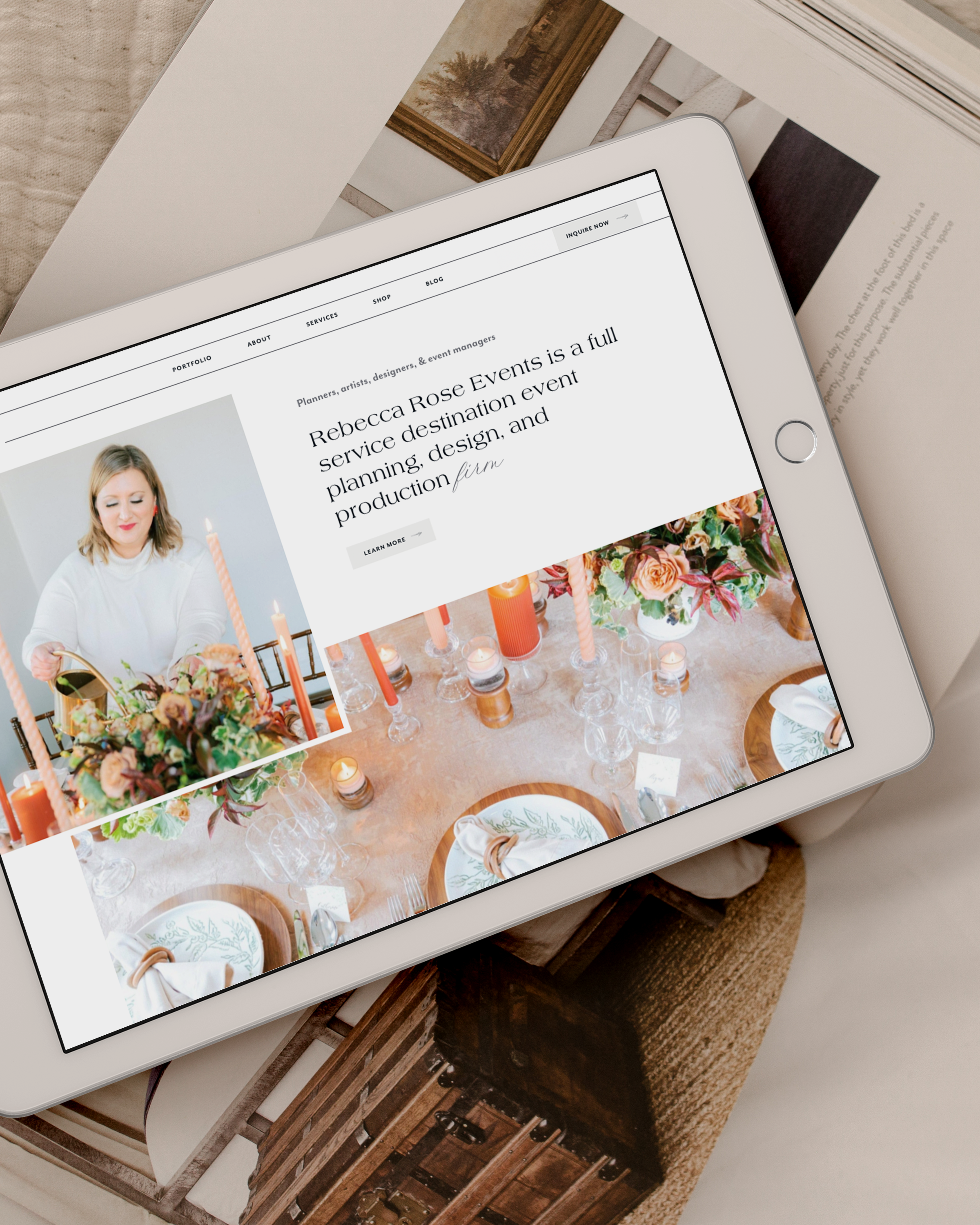
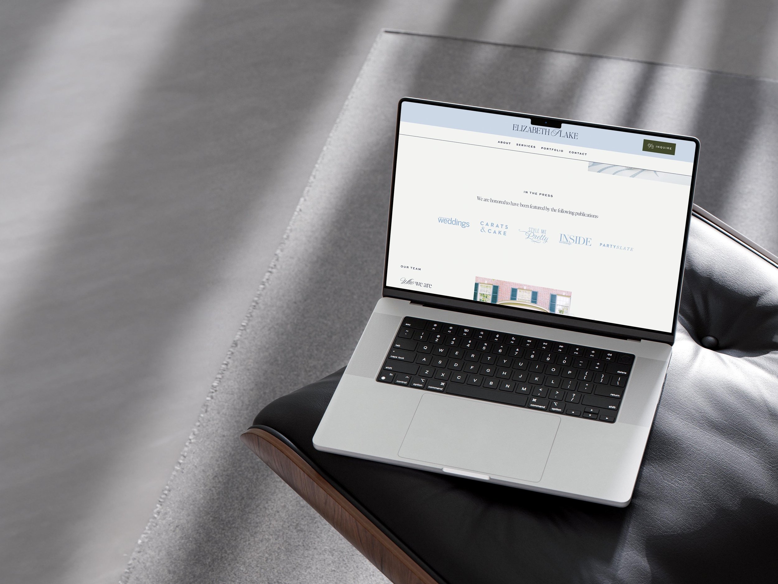
For our incredible client @courtneyleigh's website, we did this with a headline at the top of her site that clearly communicated what her services are and where she's based. Visually, we were very intentional about the color palette and the images we picked to go front and center to communicate the first impression. The visuals and photos reflect Courtney, her brand, and her clients. Along with that, the written content clearly communicates what she does. That blend of stunning photos and clear, but concise content makes it impossible to pass up her website, which is exactly the sort of first impression we’re going for. We could keep scrolling the website for days, but then again, we may be a bit biased.
At the end of the day, we want your website design to reflect your brand from a visual aesthetic and to clearly communicate who your brand is and what your brand does. If your website design does this, then you’re right on track to capture and keep your client’s attention!
___
SOURCE: Gitte Lindgaard, Gary Fernandes, Cathy Dudek & J. Brown (2006) Attention web designers: You have 50 milliseconds to make a good first impression!


